Wednesday, September 29, 2010
Monday, September 27, 2010
Tuesday, September 21, 2010
Monday, September 20, 2010
SICK SON = NO CLASS
If you haven't already gotten the message I will be unable to be in class today. My son is under the weather and had to take care of him at the last minute. Please post your portraits on the blog and begin working on assignment Three which is create a Fictitious Digital Surreal Landscape.
Specifications:
No smaller than 8.5 x 11 300 dpi
Can use any program to create (photoshop,illustrator,sumo, cinema, etc)
Create a fictional environment or landscape made up of various elements, textures, and layers.
Please send any questions
Here are some links that may stimulate your creative process
CARL WARNER
William Mackinnon
Alex Mcledod
Salvador Dali
Worth 1000
Great use of color by Wolf Kahn
Escher
Wednesday, September 15, 2010
Monday, September 13, 2010
Frank Warren came up with the idea and started receiving secrets in 2005. Since then he's received and published thousands of secrets in his postcard books, online, and in museum exhibits.
Some of the secrets are actually quite eye-opening. I think the whole thing is a testament to honesty. We are all subject to the same humanity; we are all capable of the same things. Yet, we still stay separated and secluded even from the ones we love. Why are we so frightened to share what is common to all? It's amazing to see how that seclusion affects us and how badly we really do need honesty. This project provides a very unique way to access that essential need to speak and speak honestly.
http://thesecretpostcards.tumblr.com/
Uncensored
Sunday, September 12, 2010
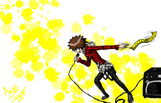
Scott Pilgrim: 8th Evil Ex entry
Monday, September 6, 2010
Saturday, September 4, 2010
CURTIS-assignment1-digital painting1

This digital painting was done from a sketch I did of the caricature artist that came to Harriman on the first day of classes (08-30-10). He is very talented. This particular artist had actually caricaturized me some years before. He did well. It seemed, however, to me that he has gotten a great deal quicker/better. Practice, practice, practice. Each pen stroke/action on his tablet was represented immediately on the screen that hung behind him(I’ve never used a functioning tablet). He drew hundreds of people, I suppose. I’ve become more and more aware of the effort one must put forth to be able to claim to be an artist, and not do so in vain. One must want it. Seeing him work as he did, inspired me to practice. I feel, I draw what I see, but it’s never enough. It’s ok though, because I know I can become a better artist if I put in the time, heart, and effort.
Nevertheless, it would have been interesting to see how the caricaturist would have used the lines to represent my face this time, in comparison to last. Alas, the line was long. I thought maybe I should create something myself, turn it around a little. Instead of enjoying seeing something he had created, I wanted to create something myself and others may enjoy seeing. My family appreciated it. It is documentation of my first day back to classes this fall (in first person). It would have been nice to have the caricature of myself, though, to go along with my sketch.
I used many layers on this one. I originally wanted it to look like a traditional painting. But I always tend to bring my sketches back, in some form. I use Illustrator a lot. I often looked to comics when younger and learning to draw. The outlined illustrated feel shows up a lot in my work. It must be because I just like to draw. I am trying to gradually get away from that and work towards a more chiseled finished look. This piece captured the moment for me, though. It caught the subject at work, mimicking the caricature style to some degree while at the same time retaining mine.
My simple graphite sketch seems to have taken on an entirely new form, thanks to the digital additions and manipulations. A sense of depth is now apparent that was not before. There is the impression of motion, if not, suspended motion in the piece. Though the color scheme is fairly simple, it adds verve.
Nevertheless, it is good to be back to classes. I am greatly appreciative to have a class I can truly enjoy and in which it is possible to incorporate my personal work into at least some of the assignments. It is also nice to have a place I can justify explaining myself and wasting a little time on the web. My next blogs will most likely not be this long and wordy.
CURTIS


